Hungarian Association of Shopping Centers
Hungarian Association of Shopping Centers

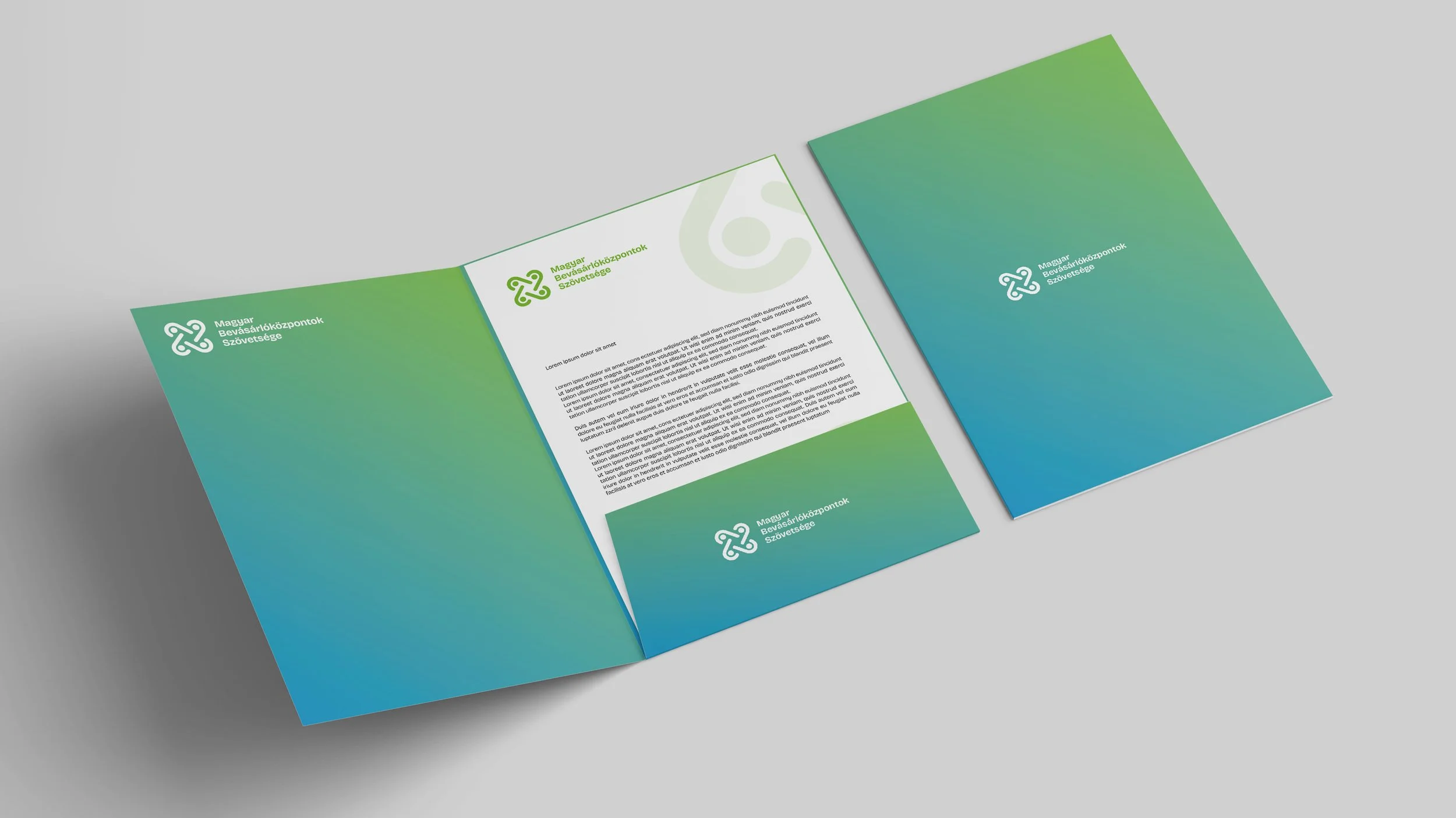
Client: Hungarian Association of Shopping Centers (Magyar Bevásárlóközpontok Szövetsége, MBSZ)
Task: New visual Identity, Brandbook
Year: 2023
About the project
-
The Hungarian Association of Shopping Centers (MBSZ) is an industry organization representing over 63 shopping centers and 147 hypermarkets across Hungary, collectively operating on more than 2,300,000 m² of retail space. Their mission includes promoting the development and reputation of physical retail spaces where people shop, dine, socialize or work; supporting innovation in the sector; conducting market research; organizing professional forums; and acting as a voice for the industry in media, policy, and stakeholder communication.
-
In 2023, Nhood Hungary (where I was employed full-time) won the contract to rebrand MBSZ. The brief was clear: the organization wanted to completely break away from its previous visual identity and establish something fresh, modern, and human-centered. As part of the project, I was responsible for all visual design, working directly with the Marketing Manager. I collaborated closely with a copywriter, helping to shape not only the logo, colors, and typography but also the tone of voice and messaging of the new identity.
-
Tight deadlines & heavy workload: I was simultaneously handling other design demands for Auchan Korzó, Nhood Hungary’s own campaigns, Boróka Park, and additional retail projects. To manage this, I developed three distinct visual directions early on, so we’d have options to choose from and could move quickly once a direction was approved.
Bold vs conventional: One of the proposed versions embraced a bold, 3D illustration/animation-inspired style (then trendy but not yet widely adopted in the local retail association branding space). It was a risk: stepping away from the typical corporate visual language. But MBSZ were open and even enthusiastic about taking that leap.
Balance between identity and innovation: The final design needed to resonate with a corporate audience — member centers, developers, retailers — while also projecting a fresh, modern, human feel. I solved this by combining a more traditional corporate setup (logo, color palette, structure) with vibrant, bold illustrations, expressive but with enough polish to be credible. The result is a brand look that feels approachable and contemporary without losing professionalism.
-
Full brand book (logo & its variants, typography, color palette)
Illustration style guidelines
Photo usage guidelines
Mock-ups & examples across touchpoints (print, digital)
Web template (for future content and online communications)
Written brand voice guidelines, created in collaboration with the copywriter