Tilia Offices
Tilia Offices

Client: Tilia Offices
Task: Brand Identity, Web, Presentations
Location: Szeged, Hungary
Year: 2023
About the project
-
Tilia Office is an office complex located in the heart of Szeged, at Gutenberg Street 25. It’s being developed by KÉSZ Ingatlan, part of the larger KÉSZ Group, in collaboration with strategic partners.
The project is designed to offer roughly 5,300–5,800 m² of rentable office space, around 900 m² of commercial / retail unit space, a deep garage with 90 parking spaces, and high-standard amenities.
Tilia Office emphasizes sustainability, energy efficiency, and wellbeing. Key features include:
Bicycle storage with shower facilities
Electric car charging stations
Selective waste collection
A solar power system, geothermal heat‐pumps and ground probes for energy management
LED lighting for energy-saving illumination
Green elements: tree planting (one tree per ~20 workstations)
Full accessibility (barrier-free design) as well as compliance with international sustainability / ESG standards: aiming for WELL Platinum, BREEAM Excellent, ACCESS4YOU Gold certifications.
The ambition is to create “a space for success” — not just an office building, but a vibrant, liveable work environment where ideas converge. It’s meant to appeal to forward-looking businesses seeking quality, sustainability, and a central city location with modern comforts.
-
I was the sole graphic designer responsible for the brand identity, web design, and presentation materials of the Tilia Office project. My tasks included developing the complete visual system — from logo and color palette to typography and illustration style — and applying it consistently across digital and offline touchpoints. I also designed the website layout to reflect the building’s values of sustainability, community, and modern workspace culture.
Throughout the project, I collaborated closely with Beri-Kocsis Diána, who managed client communication and helped coordinate the strategic alignment between the design work and the client’s expectations. This setup allowed me to focus fully on the creative direction and execution, while ensuring that every deliverable resonated with both the project’s ambitions and the client’s sustainability-driven narrative.
-
Key Words & Specific Requests
The client emphasized three central values to guide the brand identity:
Sustainability – reflecting their commitment to environmentally responsible development and internationally recognized certifications (WELL Platinum, BREEAM Excellent, ACCESS4YOU Gold).
Community – highlighting the role of Tilia Office as not just a building, but a vibrant, shared space for collaboration and human connection.
Workspace – underlining the project’s ambition to create a high-quality, modern, and flexible work environment in the center of Szeged.
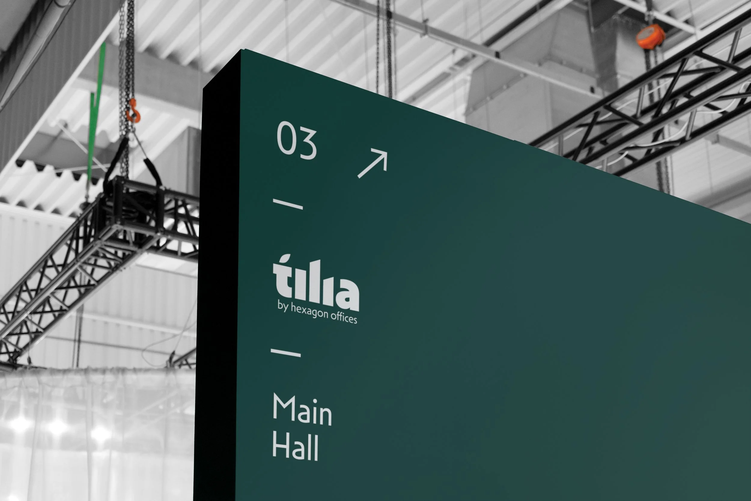
A unique and meaningful request was to integrate the “Tilia cordata” (small-leaved linden tree) into the visual identity. This tree species lines both the street and the courtyard of the building, and great efforts were made during the redevelopment to preserve them. Importantly, the entire office complex was named Tilia Office after these trees, which made it essential that the logo visually reflect this connection. The client wanted the linden motif not only as a symbolic reference to sustainability, resilience, and growth, but also as a direct identity marker, anchoring the brand to both its name and its environmental mission.
My Favorite Version
of the Identity
The very first version I created for Tilia Offices was a modern, playful, and bold concept — more “out of the box” than what is usually expected in office branding. It turned out to be too daring for the client at that stage, but it remains my personal favorite.
Some of its ideas, however, carried over into the final identity:
the leaf motif, symbolizing both the Tilia tree and sustainability,
the stylized illustrations, which were refined but kept as part of the visual language,
and a color tone close to the bluish-green shade, which became a key element of the palette.
This way, the bold first draft served as an important creative foundation, and its essence still lives on in the official version of the brand.
-
his version was built around the three core keywords: sustainability, community, and workspace.
The Wi-Fi signal shape directly referred to the idea of work and digital connectivity.
A stylized Tilia flower and leaves, resembling branching networks, symbolized both human connections and technological links, while also bringing in the sustainability angle and the project’s namesake tree.
These elements were arranged into a square-shaped structure, evoking the idea of storage units or office cubicles, grounding the playful symbols in a workplace-related context.
-
The color palette reinforced these ideas:
A yellowish tone inspired by the Tilia tree’s natural hues.
A greenish blue shade to connect with nature and stability, while also suggesting trustworthiness in a work environment.
And finally, a purple accent, chosen precisely because it is rarely combined with the first two. It complemented the yellow perfectly, while adding a sense of freshness, modernity, and a slightly alternative, “hipster” vibe — a statement that office life here is vibrant and contemporary.


Accepted Version