Charlotte Makeup
Charlotte Makeup

Client: Charlotte High-End Makeup Artistry
Task: Brand Identity Design, Web design, Writing, Styling
Year: 2021
About the project:
-
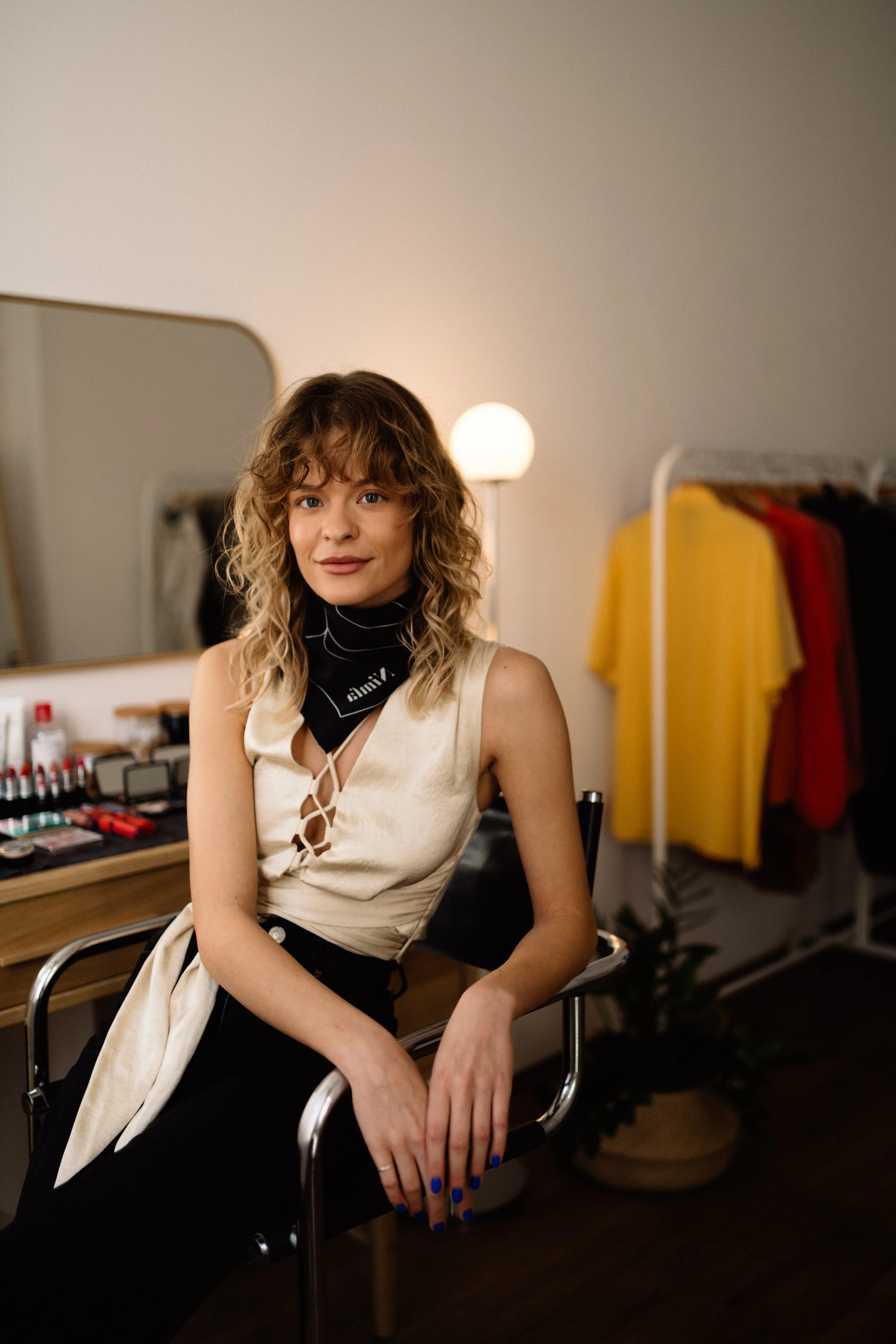
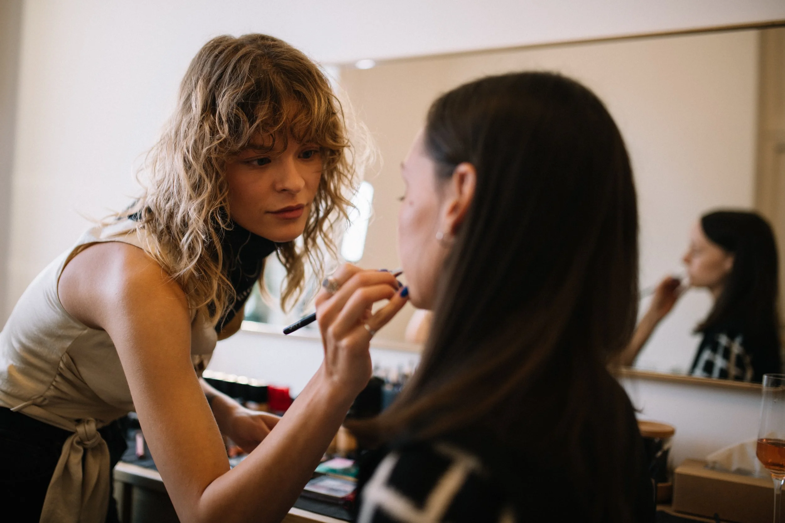
Charlotte is a Budapest-based makeup artist, specialising in high-end services for both individuals and fashion photoshoots. She approached me in 2021 after discovering my previous work, which aligned with the aesthetic she envisioned for her own brand. From the start, our goal was to create a fresh, unconventional visual identity that reflects both professionalism and subtle artistic edge.
-
Most makeup brands rely on typical beauty tropes—red lips, elegant script fonts, feminine clichés. Charlotte wanted something different: a clean, elevated identity that communicates confidence, modern taste, and a personal touch—without falling into the traps of overused visual codes.
-
Brand identity design & positioning
Moodboarding & color strategy
Logo development
Art direction & styling for photoshoot
Website design (WIX)
Copywriting: informational texts, service descriptions, "About Me"
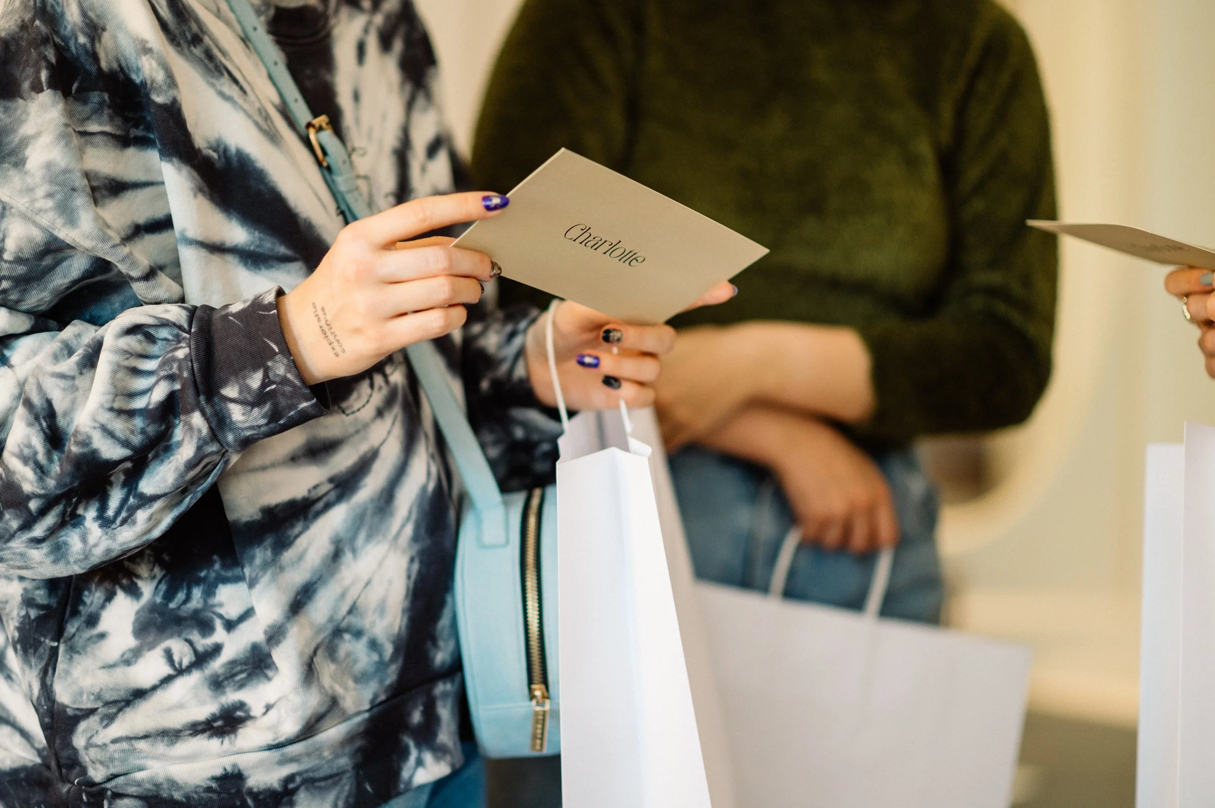
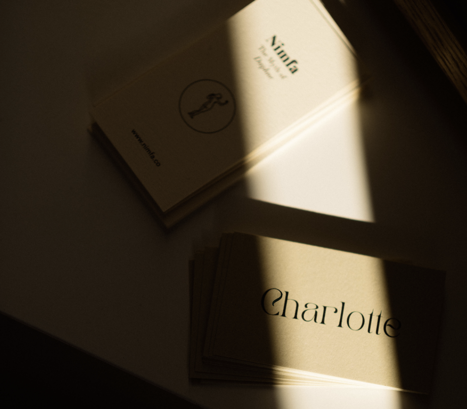
Gift card & business card design
Photo editing
-
We initially explored red tones, a classic beauty cue—but quickly felt it was too expected. Instead, we turned toward colors that are less common in makeup branding, yet often present in the makeup process itself: burnt orange and olive green. These provided an earthy, grounded feeling with just enough vibrance to feel fashion-forward.
For the logo, we avoided typical beauty motifs. While I explored Matisse-inspired hand-drawn faces during ideation, we ultimately chose to represent .we decided that a clean, typographic solution would be more powerful. The logotype — set in Tan Pearl — subtly evokes the flow and control of an artist’s brushstroke through its refined, slightly irregular curves. This kind of simplicity and subtle edge was a conscious choice throughout the brand.
This minimal yet distinctive direction guided the entire identity: clean layouts, neutral spacing, and purposeful use of negative space.
-
Full brand identity and brand book with assets
WIX website, including portfolio, contact, booking, and about pages
Gift card and business cards and social media templates
Styled and edited photoshoot visuals
Rewritten informational texts and brand tone of voice
-
Charlotte’s visual identity now clearly distinguishes her in a competitive market. The combination of earthy elegance and structured minimalism gives her brand a timeless yet personal feel—mirroring both her work and personality. The website supports her growth with a clear structure and booking system, while her visual assets reflect a professional yet individual presence.


Process –
Concept to Identity:
-
Our collaboration began with a deep dive into visual direction through several moodboards — each exploring a different tone:
The Modernist: High contrast, bold typography, refined reds and nudes
The Parisian: Luxurious, romantic elegance in golds, warm neutrals, and classic femininity
The Bohemian Minimalist: All-natural, light-filled visuals with a soft edge
The Classy All-Natural: Minimal sans-serifs, line drawings, earthy tones
These explorations helped us define what Charlotte’s brand is not — overly trendy, generic, or cliché — and led us to a visual language that feels elegant, natural, and confidently distinct.
See the workflow and results below.
-
We tested typefaces, spacing, layout structures, and developed a tone that subtly reflected makeup artistry without showing it directly.
Selected Tan Pearl Regular for its gentle yet characterful forms
Built a color palette with burnt orange and olive green, moving beyond traditional beauty cues
Avoided overused elements like drawn faces or lipstick marks — focusing instead on clarity and emotional resonance
Defined font hierarchies, iconography, and the role of abstract shapes
-
Our process was deliberately iterative — we worked in small sprints, with regular feedback loops.
Micro tasks and check-ins ensured clarity and agility
Design and content developed in parallel
Layouts were tested live in WIX, allowing flexibility and faster alignment between visual and written elements
-
Beyond the core identity, I supported Charlotte with:
Website structure (B2B & B2C segmentation, pricing logic, copywriting)
Styling and art direction for photo sessions
Gift cards and business cards
Retouching and curating visual content for consistent tone
Aligning service categories (bridal, fashion, consultation) with clear booking structure
-
During the development, we continuously returned to brand-defining traits:
feminine, bold, intelligent, modern, sophisticated, effortless, passionate, clear, independentThese became our compass points — ensuring each design decision supported this identity, visually and emotionally.
Orange Moodboard
This mid-century modern-inspired orange moodboard was one of two key second-round moodboards that shaped the brand direction.
Its structured elegance and warm, earthy tones inspired the confident, minimal foundation of the final identity.


Olive Moodboard
This classy, all-natural moodboard with some mid-century modern influence was one of two refined moodboards that guided the brand’s visual tone.
Grounded, strong, and modern. This moodboard brought in a sense of calm, natural femininity, strength, and effortlessness — shaping the brand’s understated confidence.


Exploring distinctive, brushstroke-like curves from the Tan Pearl font and experimenting with them to create visual harmony in the logo design.

Exploring distinctive, brushstroke-like curves from the Tan Pearl font and experimenting with them to create visual harmony in the logo design.

Exploring distinctive, brushstroke-like curves from the Tan Pearl font and experimenting with them to create visual harmony in the logo design.

Exploring distinctive, brushstroke-like curves from the Tan Pearl font and experimenting with them to create visual harmony in the logo design.

Exploring distinctive, brushstroke-like curves from the Tan Pearl font and experimenting with them to create visual harmony in the logo design.

Exploring distinctive, brushstroke-like curves from the Tan Pearl font and experimenting with them to create visual harmony in the logo design.

Exploring distinctive, brushstroke-like curves from the Tan Pearl font and experimenting with them to create visual harmony in the logo design.

Exploring distinctive, brushstroke-like curves from the Tan Pearl font and experimenting with them to create visual harmony in the logo design.

Exploring distinctive, brushstroke-like curves from the Tan Pearl font and experimenting with them to create visual harmony in the logo design.

Exploring distinctive, brushstroke-like curves from the Tan Pearl font and experimenting with them to create visual harmony in the logo design.
Creating the master shape using Tan Pearl font and the golden ratio. Then, combining them to create the logo, symbol and patterns.
Creating the master shape using Tan Pearl font and the golden ratio. Then, combining them to create the logo, symbol and patterns.
Finalizing the logo system, symbol and patterns.
Finalizing the logo system, symbol and patterns.
Finalizing the logo system, symbol and patterns.
Finalizing the logo system, symbol and patterns.
Finalizing the logo system, symbol and patterns.

This phase introduced the final core colors — burnt orange, olive, and soft neutrals —

This phase introduced the final core colors — burnt orange, olive, and soft neutrals —

This phase introduced the final core colors — burnt orange, olive, and soft neutrals —

This phase introduced the final core colors — burnt orange, olive, and soft neutrals —

This phase introduced the final core colors — burnt orange, olive, and soft neutrals —

This phase introduced the final core colors — burnt orange, olive, and soft neutrals —

This phase introduced the final core colors — burnt orange, olive, and soft neutrals —

This phase introduced the final core colors — burnt orange, olive, and soft neutrals —

This phase introduced the final core colors — burnt orange, olive, and soft neutrals —

This phase introduced the final core colors — burnt orange, olive, and soft neutrals —

This phase introduced the final core colors — burnt orange, olive, and soft neutrals —

This phase introduced the final core colors — burnt orange, olive, and soft neutrals —

This phase introduced the final core colors — burnt orange, olive, and soft neutrals —

This phase introduced the final core colors — burnt orange, olive, and soft neutrals —

This phase introduced the final core colors — burnt orange, olive, and soft neutrals —

This phase introduced the final core colors — burnt orange, olive, and soft neutrals —

This phase introduced the final core colors — burnt orange, olive, and soft neutrals —

This phase introduced the final core colors — burnt orange, olive, and soft neutrals —
The result: A calm, confident brand identity with a subtle edge. The logotype’s elegant curves and soft irregularities evoke the precision of a brushstroke — understated yet distinctive. Paired with earthy, atypical tones, the final identity reflects both clarity and character.
The result: A calm, confident brand identity with a subtle edge. The logotype’s elegant curves and soft irregularities evoke the precision of a brushstroke — understated yet distinctive. Paired with earthy, atypical tones, the final identity reflects both clarity and character.

The result: A calm, confident brand identity with a subtle edge. The logotype’s elegant curves and soft irregularities evoke the precision of a brushstroke — understated yet distinctive. Paired with earthy, atypical tones, the final identity reflects both clarity and character.
The result: A calm, confident brand identity with a subtle edge. The logotype’s elegant curves and soft irregularities evoke the precision of a brushstroke — understated yet distinctive. Paired with earthy, atypical tones, the final identity reflects both clarity and character.
The result: A calm, confident brand identity with a subtle edge. The logotype’s elegant curves and soft irregularities evoke the precision of a brushstroke — understated yet distinctive. Paired with earthy, atypical tones, the final identity reflects both clarity and character.

The result: A calm, confident brand identity with a subtle edge. The logotype’s elegant curves and soft irregularities evoke the precision of a brushstroke — understated yet distinctive. Paired with earthy, atypical tones, the final identity reflects both clarity and character.
The result: A calm, confident brand identity with a subtle edge. The logotype’s elegant curves and soft irregularities evoke the precision of a brushstroke — understated yet distinctive. Paired with earthy, atypical tones, the final identity reflects both clarity and character.

The result: A calm, confident brand identity with a subtle edge. The logotype’s elegant curves and soft irregularities evoke the precision of a brushstroke — understated yet distinctive. Paired with earthy, atypical tones, the final identity reflects both clarity and character.

The result: A calm, confident brand identity with a subtle edge. The logotype’s elegant curves and soft irregularities evoke the precision of a brushstroke — understated yet distinctive. Paired with earthy, atypical tones, the final identity reflects both clarity and character.
The result: A calm, confident brand identity with a subtle edge. The logotype’s elegant curves and soft irregularities evoke the precision of a brushstroke — understated yet distinctive. Paired with earthy, atypical tones, the final identity reflects both clarity and character.
The result: A calm, confident brand identity with a subtle edge. The logotype’s elegant curves and soft irregularities evoke the precision of a brushstroke — understated yet distinctive. Paired with earthy, atypical tones, the final identity reflects both clarity and character.

The result: A calm, confident brand identity with a subtle edge. The logotype’s elegant curves and soft irregularities evoke the precision of a brushstroke — understated yet distinctive. Paired with earthy, atypical tones, the final identity reflects both clarity and character.

The result: A calm, confident brand identity with a subtle edge. The logotype’s elegant curves and soft irregularities evoke the precision of a brushstroke — understated yet distinctive. Paired with earthy, atypical tones, the final identity reflects both clarity and character.
The result: A calm, confident brand identity with a subtle edge. The logotype’s elegant curves and soft irregularities evoke the precision of a brushstroke — understated yet distinctive. Paired with earthy, atypical tones, the final identity reflects both clarity and character.