Inlock
Inlock

Client: Inlock, Savings account service
Task: Brand identity design, Web design, Illustrations
Year: 2021
About the project:
-
Client / Company Overview
Inlock is a blockchain-based lending / DeFi platform headquartered in Budapest.
Their mission is to bridge traditional finance and crypto by enabling users to use crypto assets as collateral to borrow stablecoins, and to earn interest on crypto holdings.
Key features of Inlock include:Crypto collateral lending (users deposit crypto and borrow against it) Savings / interest-earning accounts for crypto holdings
In-platform token (ILK) and referral / bonus incentives
Inlock occupies a niche in FinTech / blockchain / DeFi / lending. Because it combines crypto, user trust, financial flows, and risk, their UX and product design must balance simplicity with transparency and rigor.
-
Inlock’s biggest challenge during the rebrand was building trust and clarity in a volatile and complex crypto market. While their technology and financial products were solid, the brand identity and interface often felt too technical, intimidating, or opaque for mainstream users.
The rebrand had to:
Reposition the company from a niche crypto-lending service into a trustworthy, accessible DeFi platform.
Balance dual audiences — experienced crypto users expecting depth, and newcomers needing simplicity and reassurance.
Communicate risk transparency (liquidation, collateral ratios, volatility) without overwhelming or scaring off users.
Differentiate in a crowded DeFi space, where many competitors promise high returns but fail to inspire long-term credibility.
-
I worked on the visual rebrand of Inlock as part of a collaboration with Niki Csányi., who led the project. My focus was on translating the new strategic direction into a complete, cohesive design system and digital experience:
Brand Identity → contributed to shaping a modern, trustworthy design language that aligns with Inlock’s mission in the DeFi space.
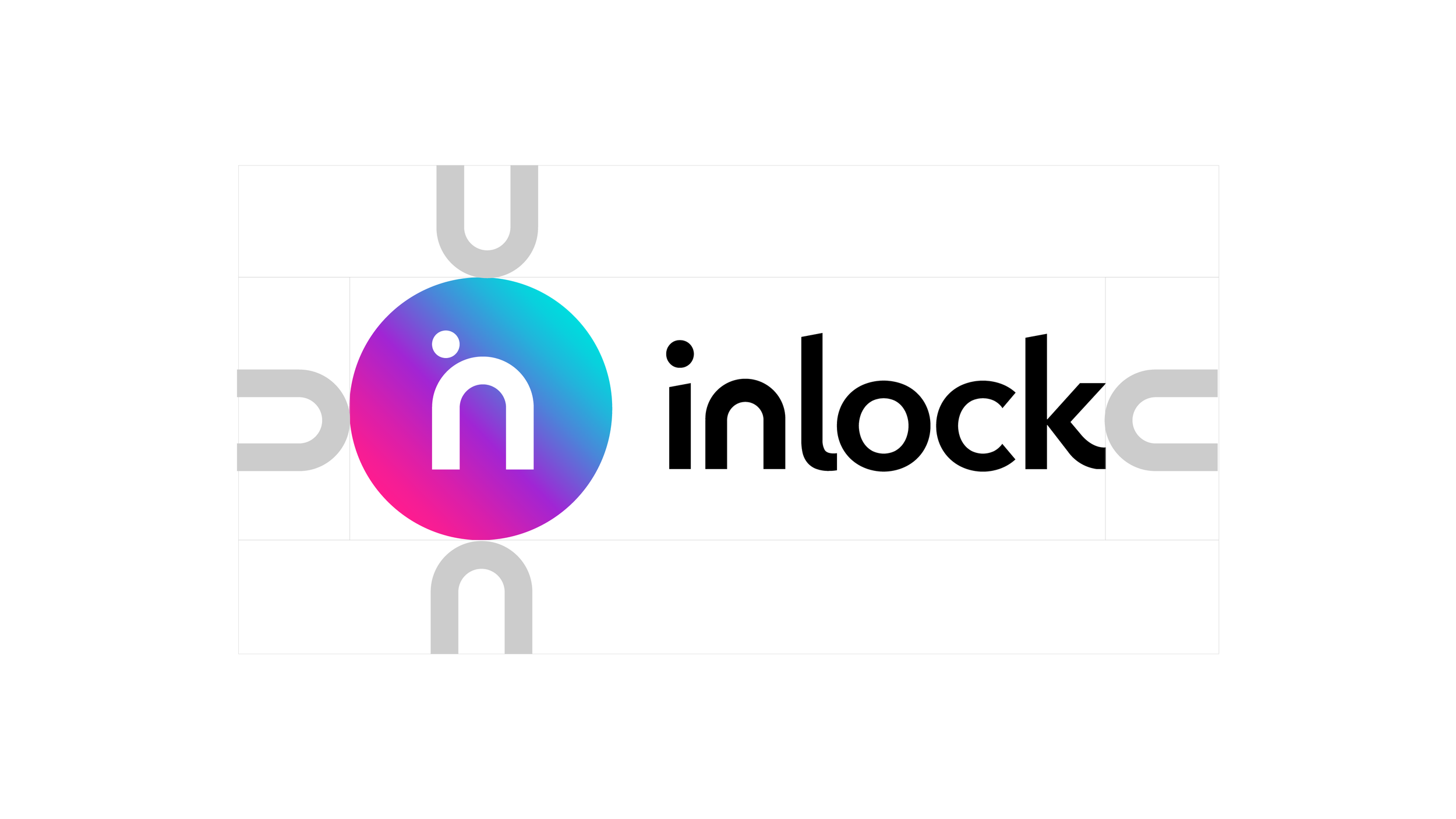
Logo Redesign → developed a scalable, distinctive logo that symbolizes Inlock’s role as a bridge between crypto and traditional finance.
Brandbook → created a detailed guideline including typography, color palette, iconography, illustration style, and UI foundations.
Custom Illustrations → designed all illustrations entirely from scratch, ensuring a unique and consistent visual storytelling across platforms.
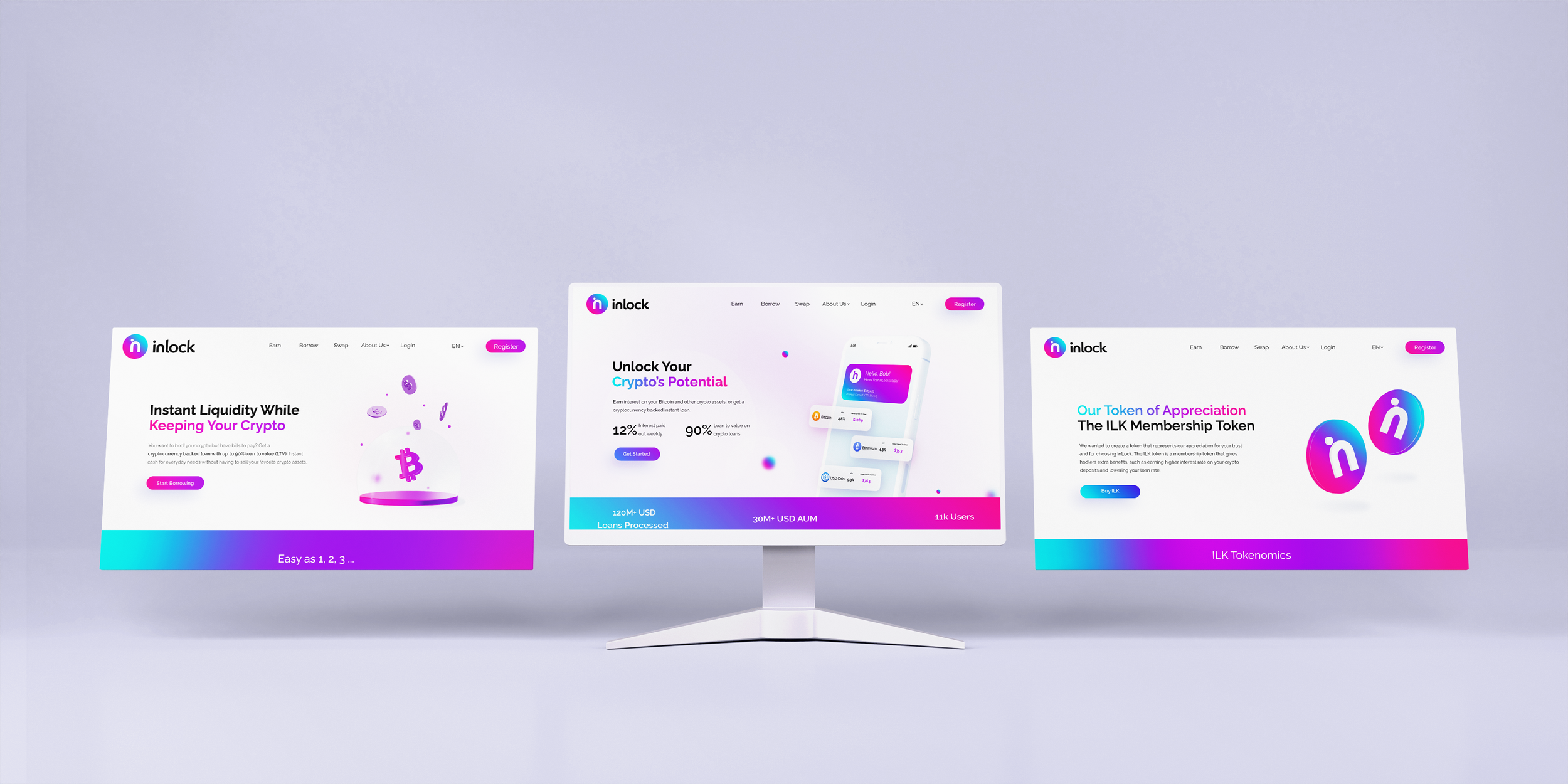
Website Design → designed the core user-facing pages to embody the new identity and improve usability:
Home Page
Borrow Page
Earn Page
Referral Page
Swap Page
Token Page
White-label Page
Blog page
Through this work, I helped transform Inlock’s visual identity into a clear, consistent, and engaging brand presence that speaks to both crypto-savvy audiences and newcomers.
-
We began the rebrand exploration with symbols that directly referenced a lock, tying back to the company name Inlock and its core value of security. Several iterations tested variations of lock-like forms, geometric padlock concepts, and abstract keyhole shapes.
However, during collaboration and feedback rounds with N.CS. and the client, it became clear that the brand needed to move beyond a literal lock metaphor. The direct references felt restrictive and too narrow for a platform that aspires to be an accessible and future-oriented player in DeFi.
The process ultimately led us to a more abstract, forward-looking symbol — one that communicates growth, trust, and connection without being tied to a single metaphor. This evolution was not only well-received but proved to be a major success with the client, as it allowed the new identity to scale across diverse use cases (consumer-facing, B2B, and white-label products) while staying flexible for future brand extensions.
-
Logo Redesign → new symbol and logotype
Brandbook → typography, color palette, iconography, UI foundations, usage rules
Custom Illustrations → full illustration set created from scratch
Website Design (core product and marketing pages):
Home Page
Borrow Page
Earn Page
Referral Page
Swap Page
Token Page
White-label Page
-
The rebrand gave Inlock a clear, modern, and professional visual identity that strengthened its positioning in the highly competitive DeFi market. The new logo and brand system moved the company away from narrow, literal symbolism and toward a flexible, future-proof identity that can scale with new products and services.
The introduction of custom illustrations and a consistent design language helped simplify complex financial concepts, making the platform feel more approachable to both crypto-native users and newcomers.
The redesigned website created a streamlined user journey across core products (Borrow, Earn, Swap, Referral, Token, White-label), aligning the brand’s visual presence with its strategic goals and improving communication of value and trust.
Overall, the rebrand achieved:
Stronger brand recognition in the DeFi space
Improved user confidence and trust through clarity and visual consistency
A scalable identity that supports growth, partnerships, and white-label opportunities